In my last post, I talked about the relative scarcity of resources when it comes to digital values for the Golden Dawn colors. Unfortunately it’s not just in the digital arena that practical color information is scarce and difficult to come by. Tabatha Cicero gives specific paints in Secrets of a Golden Dawn Temple, but some of these paint colors are no longer made and others have drifted in their Munsell values from what they represented when the book was written.
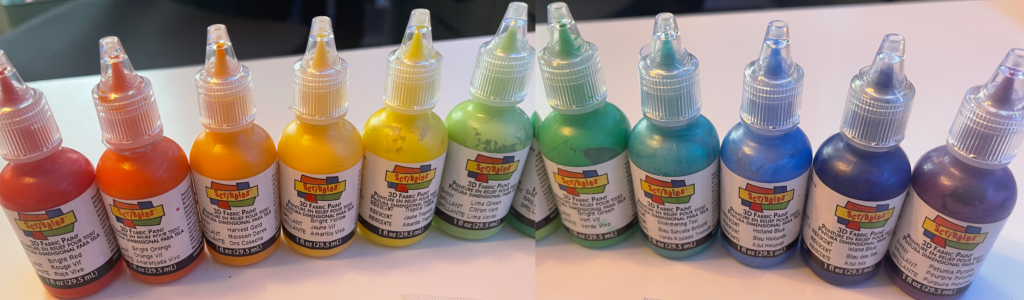
The following is a list of paints that I have used in creating my own tools, and which I recommend as a starting point for others. When possible I’ve provided colors from two paint lines: Liquitex Heavy Body, which is great for ground coverage; and Scribbles 3D Fabric Paint, which stands out well from the ground in order to contrast with it.
| Generic Color Name | Liquitex Heavy Body Color | Scribbles 3D Fabric Paint Color |
| Red | Naphthol Red Light | Shiny Bright Red |
| Red Orange | Pyrrole Orange | Shiny Bright Orange |
| Orange | Cadmium Orange Hue | Harvest Gold |
| Yellow Orange | Yellow Orange Azo | Shiny Bright Yellow |
| Yellow | Cadmium Yellow Light | Iridescent Tropical Yellow |
| Yellow Green | Vivid Lime Green | Shiny Lime Green |
| Green | Light Green Permanent | Shiny Bright Green |
| Blue Green | Iridescent Shimmering Teal | |
| Blue | Cerulean Blue Hue | Iridescent Holland Blue |
| Blue Violet | Phthalocyanine Blue (Green Shade) | Iridescent Island Blue |
| Violet | Prism Violet | Shiny Petunia Purple |
| Red Violet | Deep Magenta | Shiny Wine Cordial |
| Black | Mars Black | Shiny Black |
| White | Titanium White | Shiny White |
| Grey | Neutral Gray 5 |
I wasn’t able to find a suitable Liquitex equivalent for Blue Green; instead I recommend Golden Artist Colors Light Turquois (Phthalo).
For Citrine, Olive, and Russet colors we have to turn to a different line of paints. Citrine and Olive are a good match for Folk Art 503 Yellow Citron and 449 Olive Green, respectively. Russet can be achieved with Americana Acrylic Russet.

Personally, I do not have a steady hand when it comes to brush work, whether for line or for lettering. The tip of the Scribbles paint vials is narrow enough that I found it easier to do both lines and lettering this way than via traditional paint and brush methods, but this technique is extremely fussy: it requires precise pressure as you squeeze the vial along with keeping the tip ever so slightly above the work surface so that the tip doesn’t end up bisecting the line of paint you are attempting to lay down. I would imagine someone with a steadier hand would achieve better results. I don’t know how well the Scribbles paints would apply via brush, or whether it would be worth using these paints instead of the Liquitex variety if one is able to do quality lines/lettering with brushes. My speculation is that the texture of the paint would help the color to stand out more from the ground color without needing to lay down another (equally precise) set of lines and/or lettering in gesso beforehand.
Recently, however, I found a far better solution when my friends Grier Conley and Andrew B. Watt introduced me to the existence of acrylic paint markers. I recently recreated my broken Water Cup, and had the opportunity to test both the Scribbles 3D paint technique I had used previously and the acrylic marker technique side by side. I got a 12-color set of Uni Posca acrylic paint markers (PC-1M12C) and found that the color match was sufficiently good to be suitable for the purpose at hand.

There’s a slight learning curve to the acrylic markers, but the 0.7mm tip makes fine lines and lettering a breeze compared to any other technique I’ve tried or heard of. It does still require steadiness and a light touch, not unlike the Scribbles 3D technique. Going too heavy or stop-and-go on the pressure will cause a degree of cast-off speckling from the pen tip, but this is still exponentially more precise and less fussy than using the fabric paints–and the colors stand out with enough vibrancy that only a single application is necessary. In the future, I’ll be using this technique far more often.
Leave a Reply